
Hospital NOVO
Brand architecture
Hôpital NOVO (Nord-Ouest Val-d'Oise) is a new hospital resulting from the merger, on January 1, 2023, of the 3 small hospitals : Centre Hospitalier René-Dubos de Pontoise (CHRD), Groupe Hospitalier Carnelle Portes de l'Oise (GHCPO) and Groupement Hospitalier Intercommunal du Vexin (GHIV).
This merger is the fruit of a long rapprochement initiated in 2014 with the establishment of a common management team, followed by the creation of GHT NOVO in 2016. The logotype used until now did not sufficiently convey the image of a merged hospital at the service of its patients and healthcare professionals in the region. So we had to help the hospital define a new brand positioning and create a new visual identity.
Our mission began with the transformation of the acronym "NOVO" (Nord-Ouest Val-d'Oise) into a new brand called "Hôpital Novo", a common name for the 3 former hospitals, enabling them to convey a unified message throughout the region. The new name is accompanied by a new, unifying sign that reflects mutual aid, mobility and the life cycle, as well as a new identity for reinventing the local hospital and imagining the future.


01. Brand strategy
Brand platform workshop
The merger of several hospital establishments into a new, merged hospital raises many new questions and strategic issues. It was against this backdrop that we led workshops with the various stakeholders (management, medical staff, caregivers, patients), enabling us to establish a shared diagnosis, and then collectively define the new brand platform for the establishment. Many thanks to the medical, administrative and technical teams for their trust, sharing and welcome.


02. Logotype
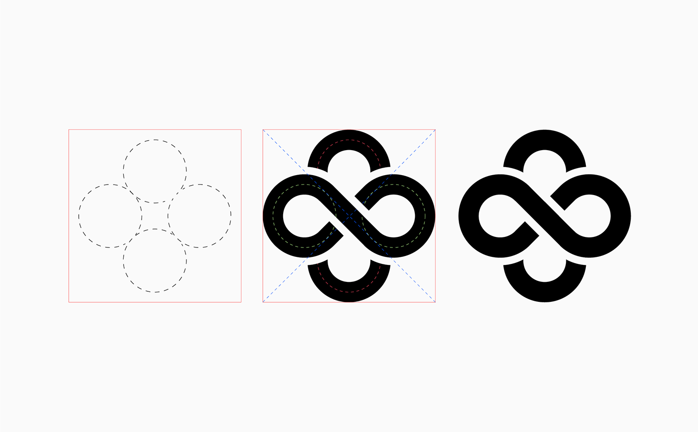
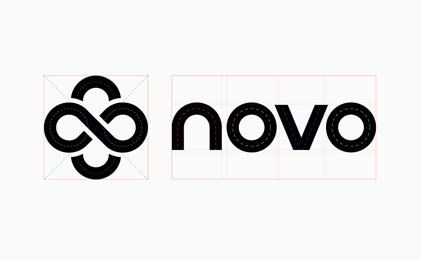
A unifying sign
The creation of this sign is inspired by the graphic heritage of GHT NOVO, to create a link between yesterday and tomorrow. It appropriates the codes of the hospital sector to express the vision of the merged hospital. A sign that speaks of commonality, benevolence and union, guiding the actions of healthcare professionals. It embodies the hospital's mission: to help mobility evolve in the region, to innovate together, in the service of better local care.


A revisited medical cross
to reinvent the hospital of tomorrow
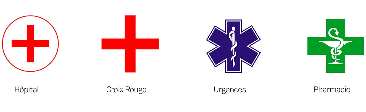
Some researchers consider the cross to be one of the first signs drawn by humans. All kinds of crosses have been found, drawn or engraved in cave art. The Greek cross (a cross whose arms are of equal length and cross in the middle) owes its association with the medical world to the Red Cross. Created at the end of the 19th century, the humanitarian organization chose it as its emblem. At the time, it symbolized the protection afforded by international law to the wounded, sick and those who cared for them during armed conflicts. It tells combatants that they must not attack people or objects displaying these emblems. During this period, many product manufacturers added the emblem to their products, and pharmacists also adopted it as a symbol.
The NOVO Hospital reappropriates the cross symbol and reinvents it. The rigor of verticals gives way to roundness, encounter and movement. Symbolically, Hôpital NOVO illustrates its new vision of healthcare in the region. A benevolent hospital that, thanks to mobility and union, creates links between healthcare professionals and patients.
03. Brand architecture
Organizational clarity
With this sign, NOVO Hospital adopts an umbrella brand architecture with a variation for each of its 6 sites. This architecture creates a common, coherent graphic system. It gives the hospital a high profile, while simplifying understanding of its organization.


04. Colors and typography
An accessible and caring way of speaking
The hospital is a place where young and old come together. One story follows another, and no two are alike. While the color chart reflects this diversity, the message must be visible and understood by all. In keeping with the sign's round, geometric design, ITC Avant Garde Gothic Pro plays its role as an ergonomic, high-impact typeface for headlines. In addition, Articulat FC, more suitable for everyday text, adds a contemporary touch.


05. Communications
An expressive, playful system
In keeping with the logic of the logotype, the graphic system is designed to take you on a journey from innovative to human speech:
• A round, colorful and illustrative universe, to let everyone imagine the stories of tomorrow.
• A wired, framed composition grid, to offer an innovative framework for expression and highlight the quality of care.
• A wired, framed composition grid, to offer an innovative framework for expression and highlight the quality of care.


06. Signage
Bringing identity to life on the site
The identity is presented on the site in a more sober expression, adaptable to existing materials and supports. Here are a few intentions.


07. Motion design
Revealing and explaining the merged hospital
To ring in the New Year, we support the teams in unveiling the project to staff and patients. A short, entertaining video is produced to unite people around the NOVO Hospital project.

